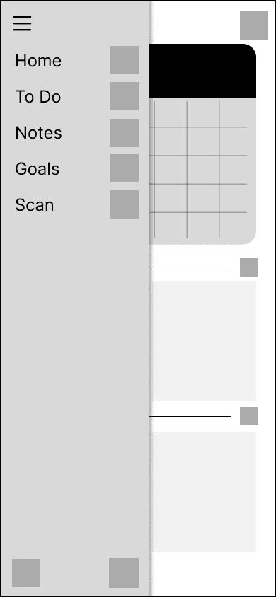
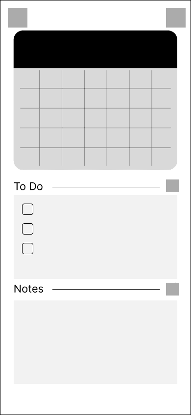
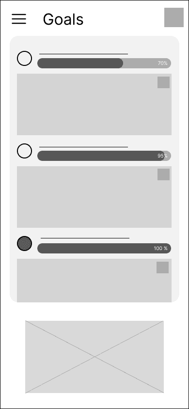
NotePoint
Crafting an intuitive organization app to integrate note-taking and task management for users.
Role + Contribution:
Design Lead, UI/UX Design, Research, Prototype
Team:
3 UX Designers
Time Frame:
January 2023 - April 2023, 4 months
Tools:
Figma, Figjam, Qualtrics
Overview
Problem Space
College students develop a habit of prioritizing their academics above balancing goals, personal aspirations, and physical health. They frequently encounter difficulties in organizing their academic workload, personal goals, and physical health, which hinders their overall well-being and academic success.
Many college students find organizing tasks, goals, and coursework alongside their current activities outside of school challenging while also keeping up a good work-life balance.
Solution
A simple and intuitive note taking and task tracking app that promoes usage through a simple interface and easy interactions that allow for an organized experience for users.
Secondary Research
Discovery-why is our problem a problem?
Why are students stressed when it comes to school work?
Academic Pressure and Stress:
The high demands of college coursework and extracurriculars increase stress, affecting both students' mental well-being and their ability to organize and plan effectively.
Lack of Effective Organizational Tools
Many students use traditional tools like paper planners or basic digital calendars, which often lack the flexibility and integration needed for their varied schedules.
Cognitive Overload
The cognitive load associated with managing multiple aspects of college life can be overwhelming, resulting in decision fatigue and impaired organizational effectiveness and work-life balance.
Primary Research: Interviews and surveys with students
Though our initial research provided a good starting point to frame our problem statement, we conducted a survey and semi-structured interviews to refine our scope and form design goals.
We conducted interviews with 6 college students and conducted a survey that reached 32 college students to gain insight their management of stress, time, and academics.
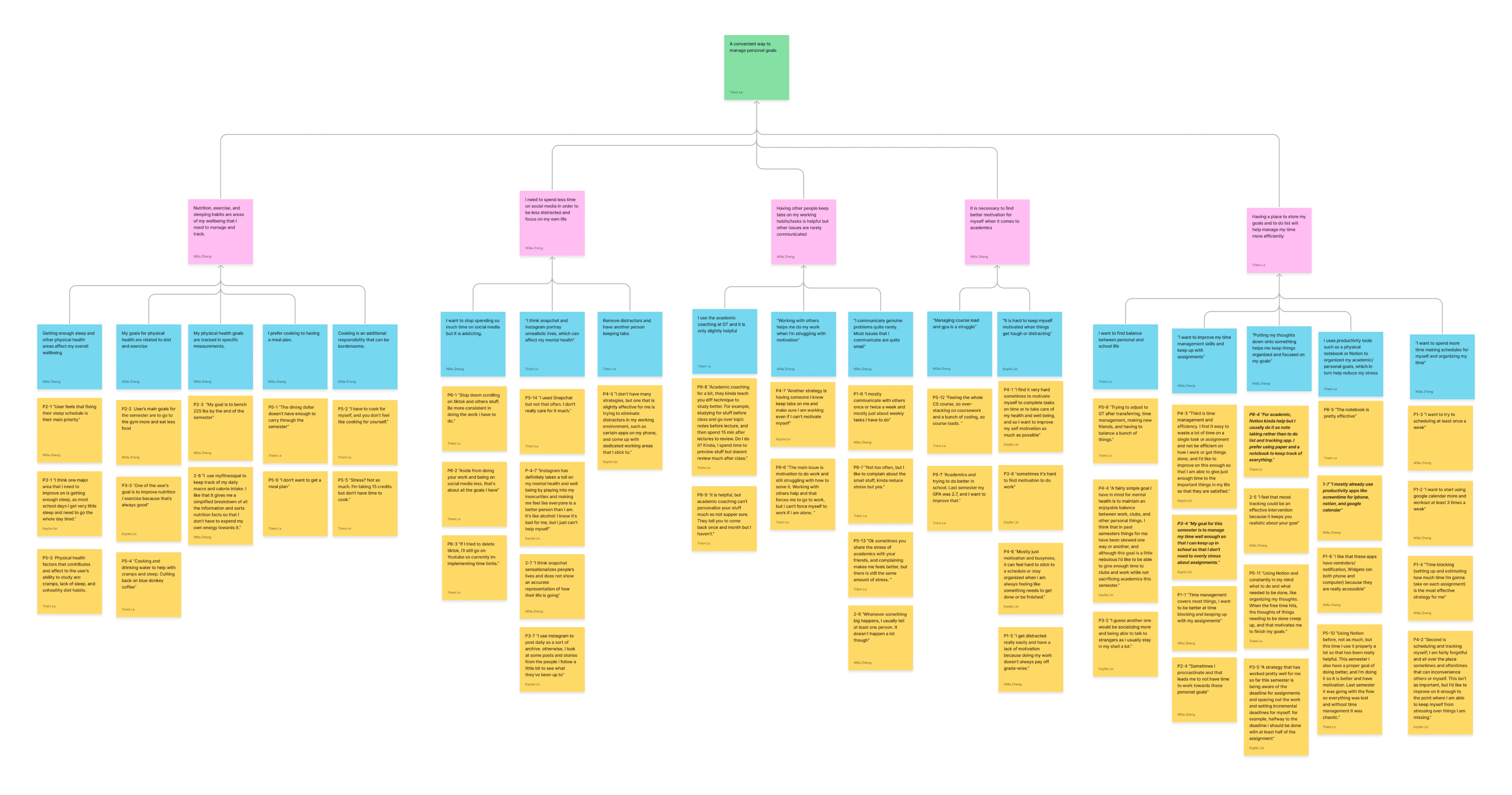
Findings
01
Many students felt moderate amounts of stress
Students reported experiencing moderate stress levels due to the demanding nature of their coursework and extracurricular commitments.
This stress often stems from competing priorities and tight deadlines, which can contribute to feelings of overwhelm.
02
Students had trouble managing their time
Many responses indicated that time management was both an active struggle and something that they have already been working on with strategies such as productivity apps, time blocking, and creating schedules:
03
Challenges in maintaining focus and motivation
Students reported difficulty in sustaining focus and motivation due to frequent interruptions and a lack of structured routines.
The dynamic nature of their schedules, combined with the pressure to excel in multiple areas, often leads to decreased productivity and engagement.
Brainstorming and User Analysis
After finding the initial problem space and figuring out which direction we wanted to approach for our product, we dove into applying our user behaviors analysis from the research into high-level scenarios. We analyzed existing popular tracking platforms and platforms our user demographic utilize.
Design Questions
How Might we…
01
Allow users to use the app while adapting to various contexts, such as work, education, or personal growth, providing users with versatile tools that cater to different aspects of their lives?
02
Integrate innovative tools or techniques that encourage users to develop a consistent habit of note-taking and journaling for both productivity and personal reflection?
03
Incorporate motivational elements within the app to inspire users to set and achieve personal goals through their note-taking and journaling activities?
Competitive Analysis
After deciding on the direction of our product, we conducted a competitive analysis of existing popular tracking platforms and platforms our user demographic utilize.
Competitive Features - Pros
Weaknesses - Cons
Apple Notes App
Quick and efficient to jot down notes
Flexible and intuitive due to its simplicity
Picture and checklist options
Limited amount of features
No category sorting
Google Calendar
Good presentation of schedule with boxes for events
Allows for notifications and reminders
Separates additions into general tasks and events
Not very flexible with what kind of information you can add
Notion
Includes many features and templates for multi-purpose functions
Available as both phone and desktop applications
Organized content style
Learning curve due to the vast amount of visible and hidden features
Lack of guidance on how to use the program
Paper Agenda
Traditional and pre-organized into sections
Tangible and quickly accessible if the user has it on hand
Not as distracting as a phone application
Must be carried around and cannot be accessed digitally if forgotten
Must purchase another if it gets full
Does not send reminders or notifications
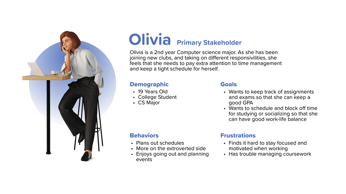
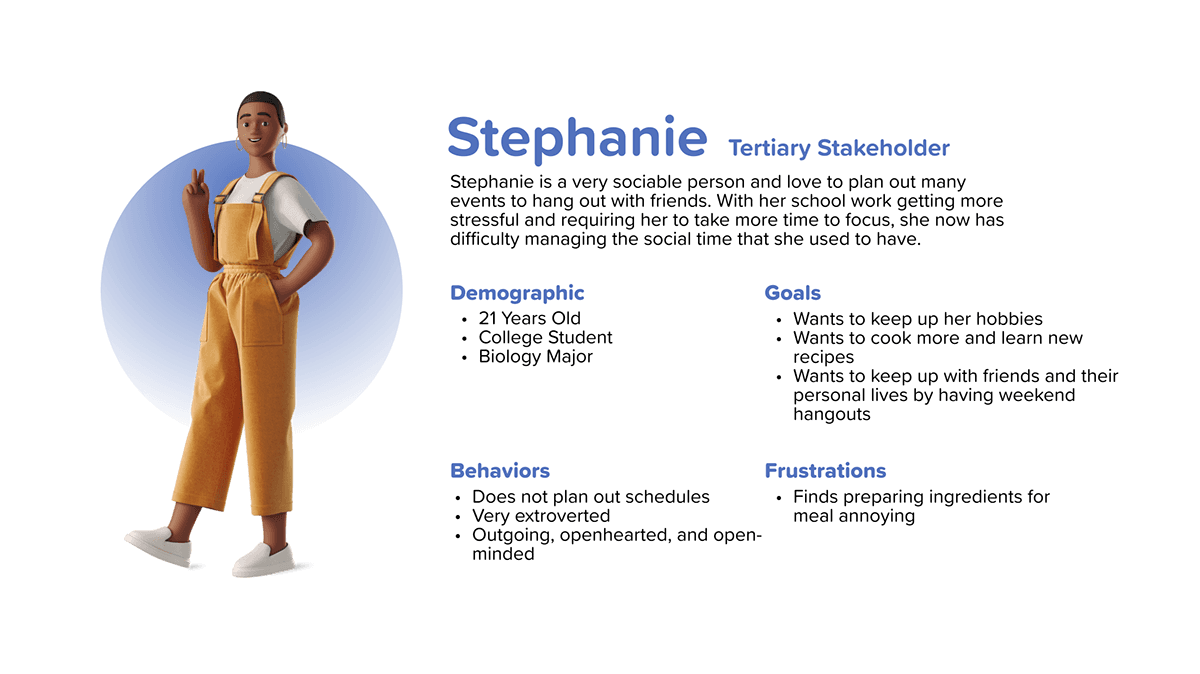
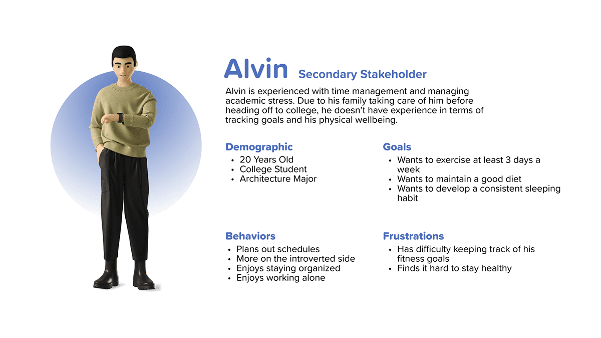
Stakeholder Analysis
Then, to better understand our user demographic, we created three personas reflecting the insights gathered during our research stage. We used these personas to do cognitive walkthroughs of different scenarios.
Storyboards
Using the personas created, we then made high-level test scenarios and illustrated them into storyboards to outline possible user paths or activities.

Task Analysis
Using the personas and the high level scenarios we developed, we also completed a task analysis to organize how our stakeholders currently accomplish their tasks to better understand their workflow.

Findings… Part 2
Because we felt like we needed more information before defining our design requirements, we sent out a second survey that was specifically about organization tools. These were our findings:
01
Yes, this is a good idea
Many students find organizing their tasks using various methods, such as planners, digital tools, or simple checklists, to be an effective strategy for staying on top of their schoolwork and extracurricular activities.
02
Simplicity and accessibility is key
When asked what people like from their digital or analog forms of organization, people responded with a diverse array of answers. However, many of them had one sentiment in common: they wanted a simple and quick product that can be accessed easily.
03
The importance of self organization
Users valued maintaining control over their task management. This translates to a need for tools that empower users to manage their own journeys without feeling restricted or dictated by rigid structures.
Design Goals
After analysis of the results from the second round of surveys, we narrowed down our goals into the following design goals. We used these themes as a guideline for user needs & desires throughout our design process.
INTUITIVE SIMPLICITY
Allow for an easy and intuitive note-taking and task tracking experience that promotes usage through simple interface and easy interactions
ORGANIZATION
Provide sophisticated organization features to help users efficiently manage and structure their notes and tasks
FLEXIBLE
Provide a free-form space and experience for our users to go in and out of the product at their leisure.
Ideation
After extensive research and analysis, we decided upon an app that follows the goals of our users and feature priorities made during brainstorming and user analysis phase.
Therefore, we started ideating in the direction of a productivity and note-taking app.
Sketches
Ideation sketches were created using the insights and issues gained during the research process, along with the feature priorities made during the task analysis and usability planning.

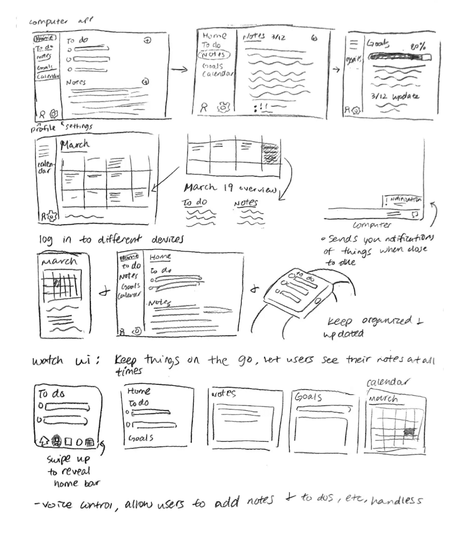

We came up with 8 ideas for the product, settling on the following 2 to implement into the final version.

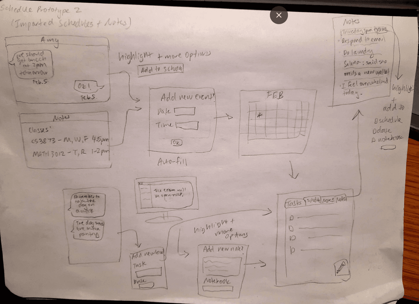
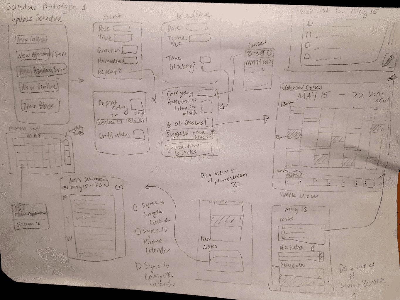
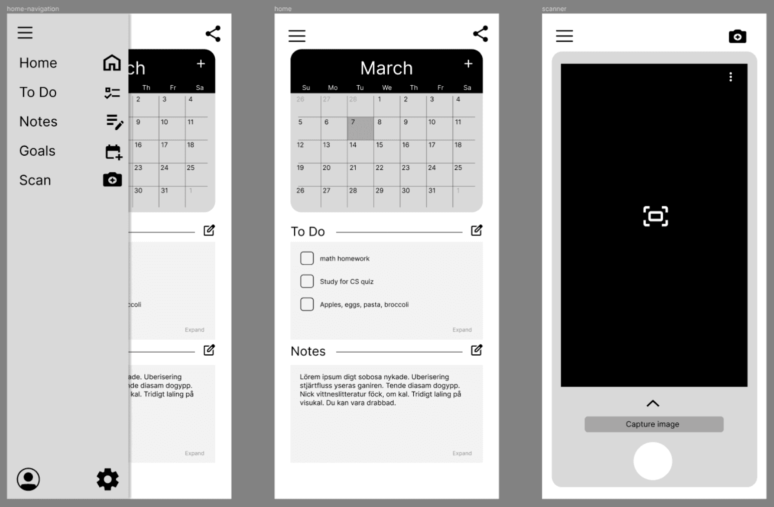
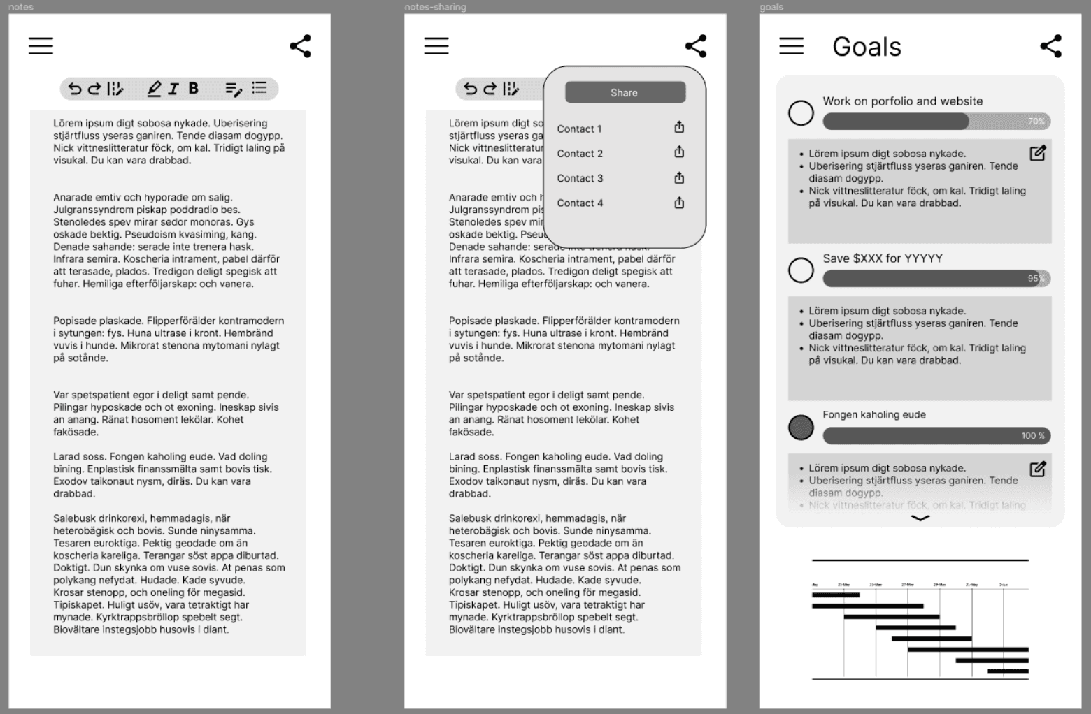
Prototyping
We then moved onto creating some simple wireframes to lay out the possible screens based off of the 2 finalized ideas for the product.
Low-Fi Wireframes
Due to my teammates not having the same amount of experience that I have with Figma, I took on the role of design lead when we moved the product from sketches to wireframes.


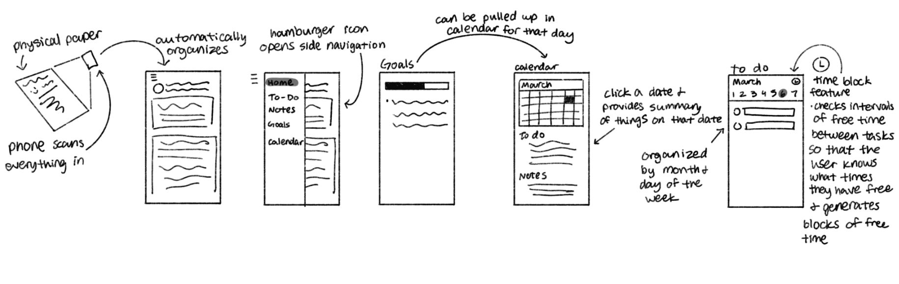
Mid-Fi Wireframes
I taught them Figma basics while we moved from low-fidelity to mid-fidelity.
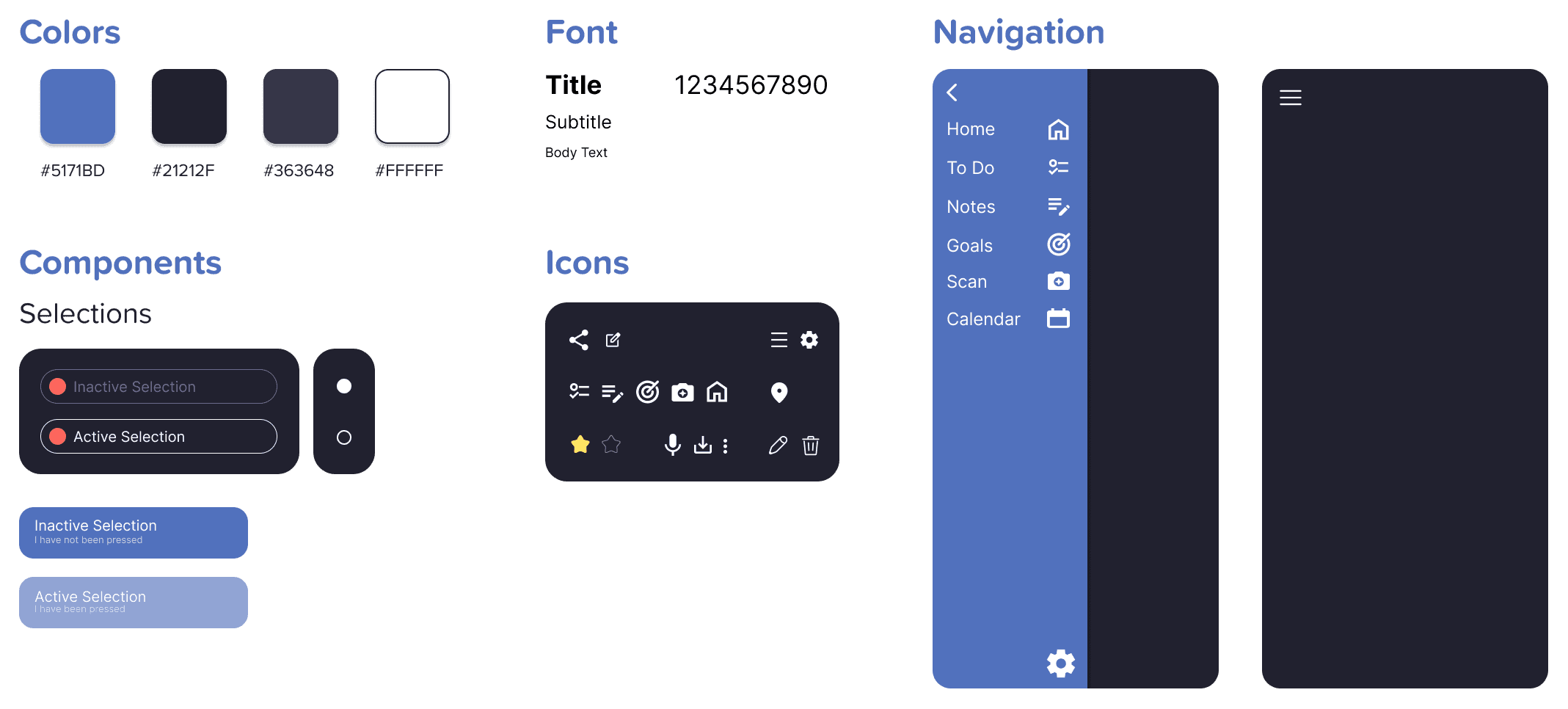
Design System
The design system was created with a clean, functional, and modern look in mind to cater towards college students. We focused on cool colors to give a more relaxing feel while also choosing a dark theme to match the preferred color schemes our user demographic enjoy.
Final Deliberables
Putting together the design and creating an interactive prototype in Figma. Upon completion of NotePoint, our team presented our product during an in-class demo day, where we got high distinction for visual design and interaction design.

User Testing Results
We conducted heuristic evaluations during in-class sessions. Following that, feedback was also gained through usability testing with target stakeholders and design critiques. Outside of in-class test sessions, we also conducted usability tests with 5 Georgia Tech students.
The feedback received showed a sounding success.
Found the product to be intuitive and reflective of their needs.
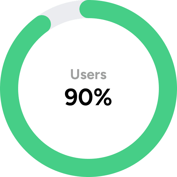
Would prefer this product over what they currently use (Notion, system default phone app, physical agenda).

Did not have difficulty navigating between screens using the Figma prototype.
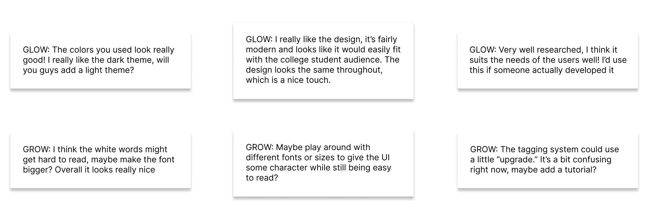
Final Feedback
At the end of development, the class showcased all of the products each group created. We received a variety of feedback:
Reflection
What I learned, areas for improvement, and my closing thoughts.
What I learned
How to do a case study
Being my first official full length UX design project, I had the opportunity to build the fundamental skills through this project. Using double diamond design model for the design process helped us organize our design process and focus our efforts collaboratively.
Figma Features
This was my very first full length Figma-based product that I designed. I watched a large number of tutorials on how to best use Figma's features that contributed to the overall success of the product's design and functionalities.
Collaborating with a team in a UX context
Working with a team taught me to cooperate with everyone's different research and ideation styles, allowing me to grow as a designer. It also taught me how to effectively communicate ideas to my team in a way that they could all understand.
Areas for Improvement
Usability Testing
If I had more time I would've liked to do more usability tests to confirm if our user's needs are truly being met. While we have conducted user testing after the final prototype was created, I feel that we could improve upon the design by gathering a variety of users as well.
More Interactivity
I would also have liked to incorporate more efficient interactions in the Figma. Currently our prototype allows for users to click most buttons and navigate around the prototype, but due to our inexperience in Figma at the time, the prototype itself is not very efficient.
Final thoughts
My teammates and I all agree that we've learned a lot about UX design from this project. This project was new and challenging for the group to adapt to, but I think we all tackled it well and the outcome is something we're all proud of.