Cultured
Designing a learning app to bridge the gap for students who seek knowledge of diverse cultures from around the world.
Role + Contribution:
UI/UX Design, Research, Prototype, Brand
Team:
3 UX Designers
Time Frame:
January 2024 - April 2024, 4 months
Tools:
Figma, Figjam
- User Research -
User research and analysis, understanding our user demographic's thoughts.
Context
Second-generation immigrants and college students often express a curiosity about their own heritage and various cultures worldwide, seeking opportunities to broaden their understanding beyond their own cultural background.
However, amidst the demands of academic life, extracurricular commitments, and social activities, they find it challenging to stay motivated and committed to cultural exploration.
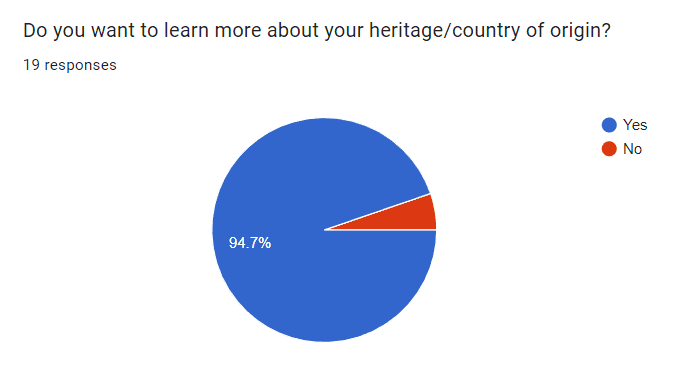
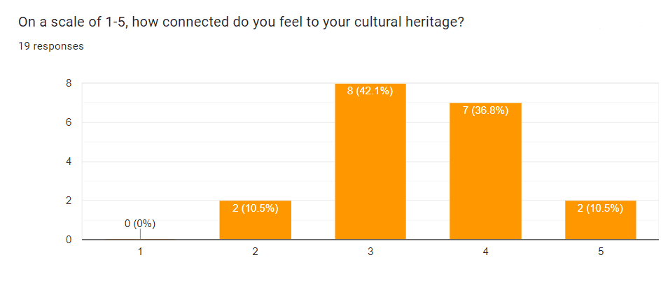
We conducted a survey that reached 19 college students to gain insight into how they currently learn about other cultures. These were our findings:
Yes, this app is a good idea.
Many students resonated with the idea of an educational app that teaches them about their heritage and other cultures.
The burden of research and learning
Researching and learning consistently feels difficult. Keeping themselves committed to learning without fun proves difficult to continue. Users cited consistency, language barriers, and not knowing where to start as blockers.
Simplicity of knowledge
When asked what type of resource would best help in learning, people responded with a diverse array of answers. However, many of them had one sentiment in common:
A simple and accessible product that has a good balance between easy and difficult sources to learn from.
Traditional methods of learning about cultures often lack the immersion necessary to captivate student's interest.
The absence of a centralized resource for cultural education coupled with the lack of engaging and interactive learning tools further complicates students' quest for cultural knowledge.
Solution
We decided to create a fun educational app that contains engaging content like games and informative lessons to teach our users about various topics from different cultures.
- Brainstorming -
Application of user behaviors analysis from previous research into high-level scenarios. Analysis of existing popular tracking platforms and platforms our user demographic utilize.
Market
Research
Analysis of existing popular culture education platforms.
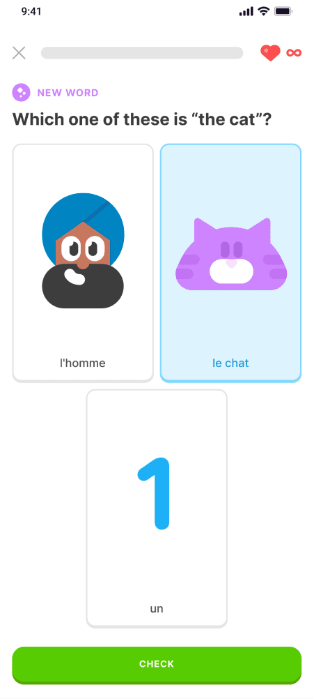
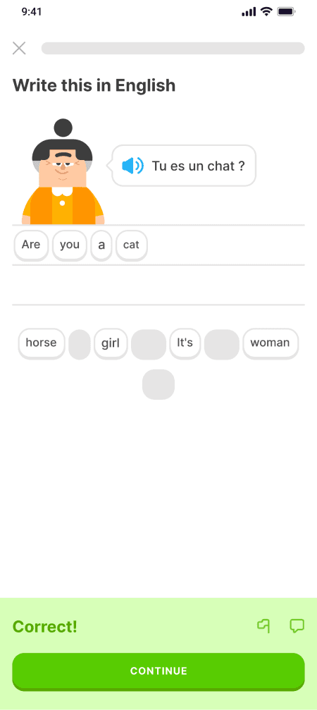
Duolingo
Strengths
Exposes users to basic cultural elements
Sparks interest in different cultures
Introduces cultural context for some vocabulary
Weaknesses
Limited depth and context - does not delve deep into cultural nuances
Focuses on language, not culture
To better understand our user demographic, we created one persona reflecting the insights gathered during our research stage.
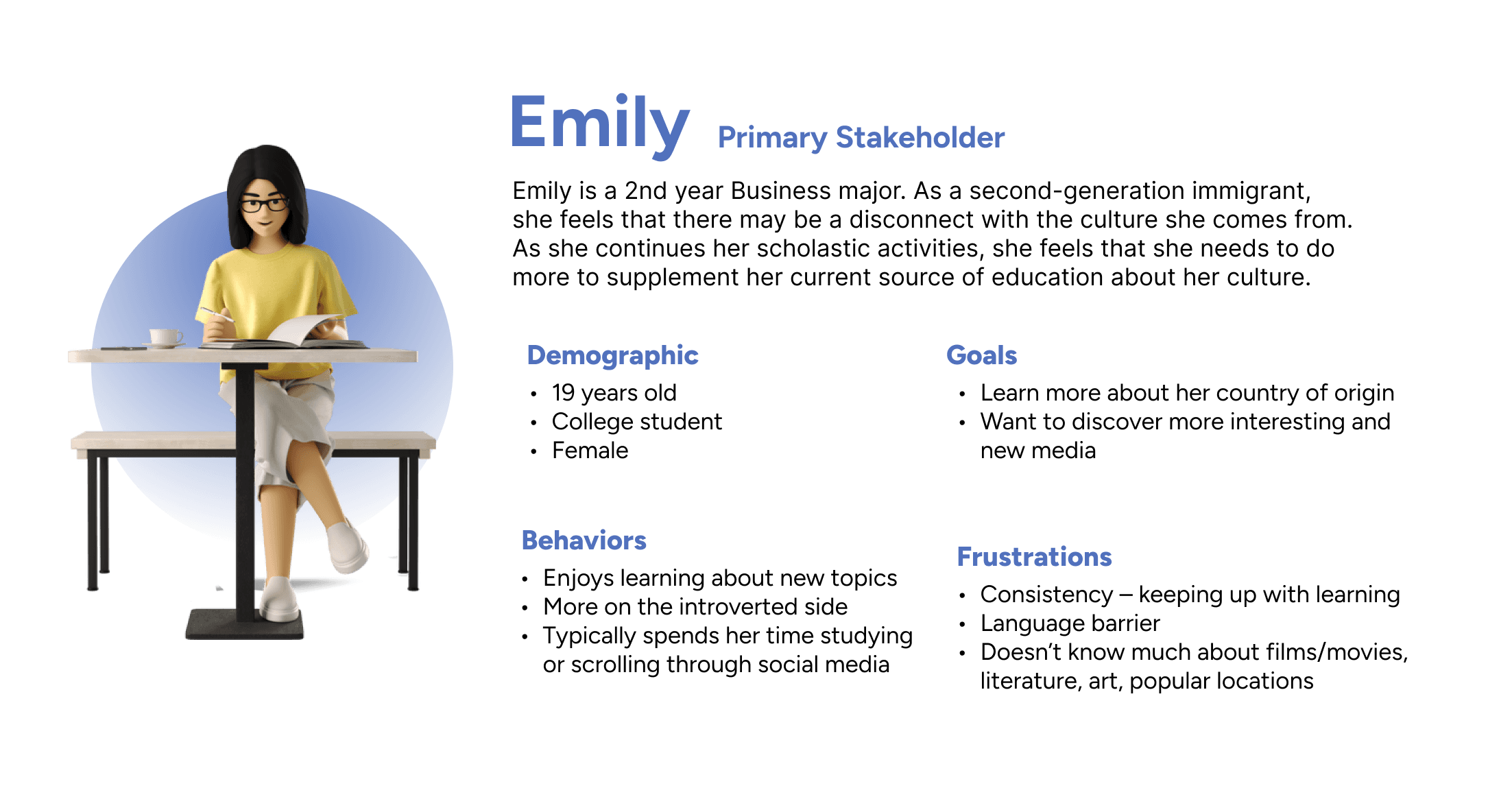
We applied design thinking accounting the perspective of Emily into the ideation process.
- Ideation -
After extensive research and analysis, we decided upon an app that follows the goals of our users and feature priorities made during brainstorming phase.
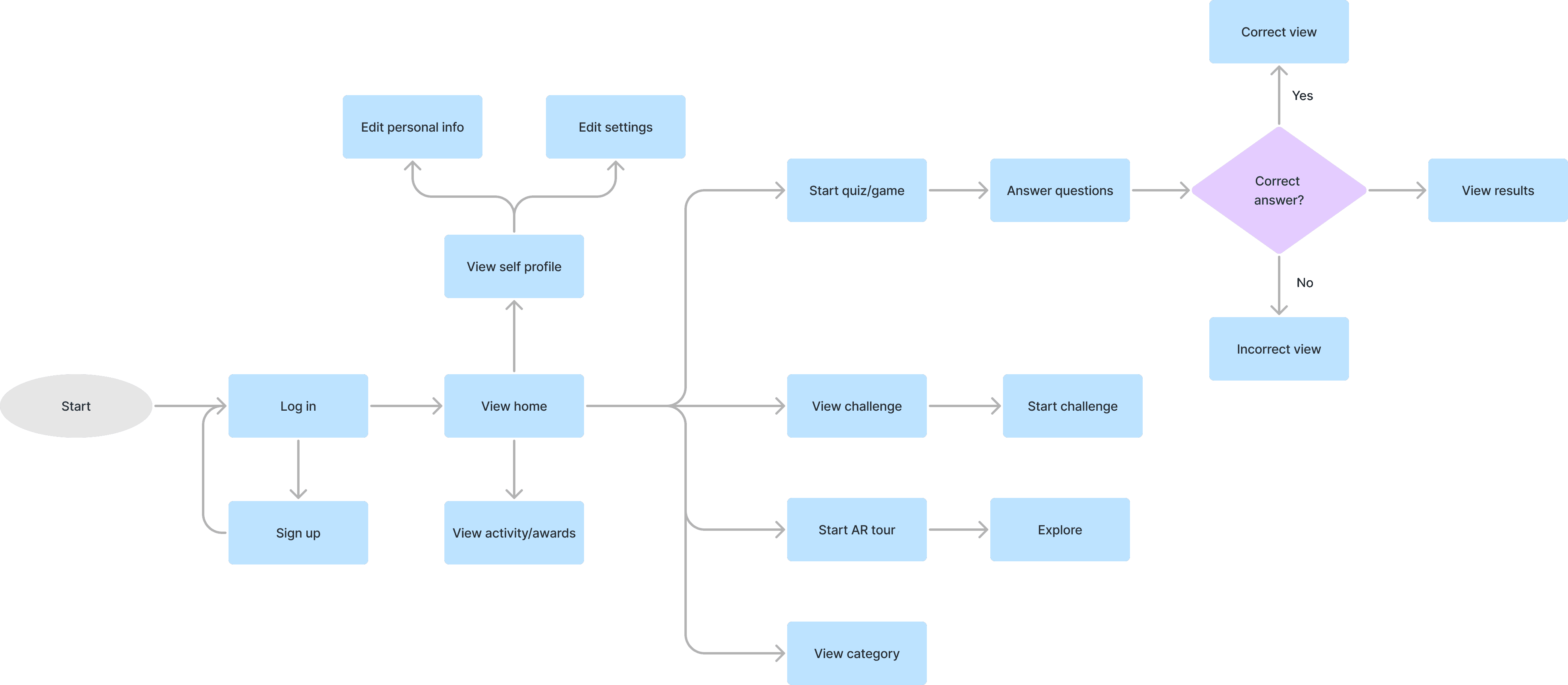
User Flows
Using the synthesized insights from the previous stages, we realized that to accomplish the necessary goals, we would have to implement a number of features that kept our users engaged, the app interactive, and our users motivated to keep using the app.
The following flow was created as a general structure for the app.
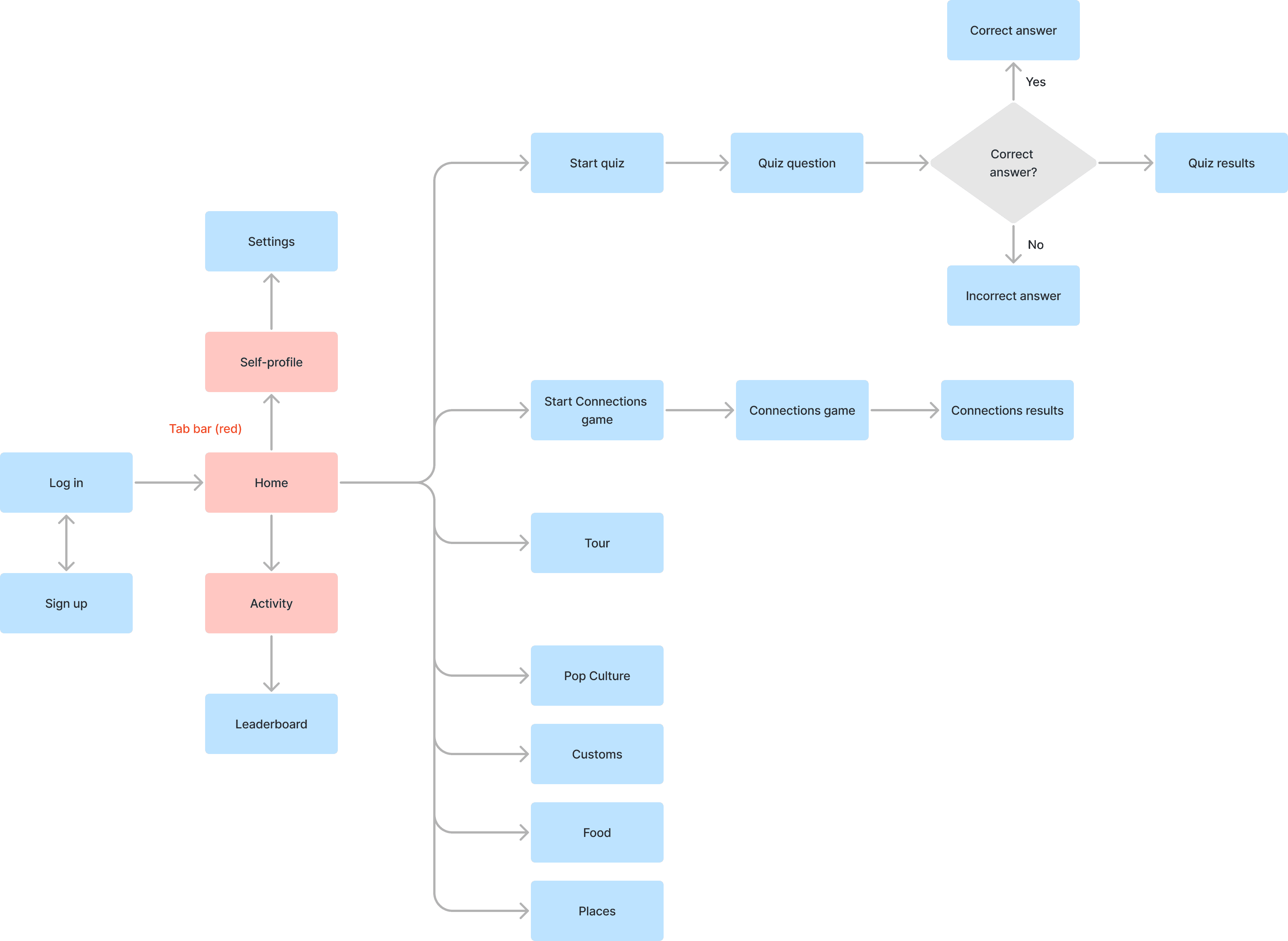
There was also a flow created that went into more detail on the specific screens and features of the app. This was created so that the developers had a better idea of the possible screens.
After user analysis and the creation of user flows, our design lead assigned us to develop different screens of the app.
Our group met on Tuesdays and Thursdays to review progress, give feedback, and provide assistance.
My tasks
Create the Friends Views (Friends list, Add/Invite Friends)
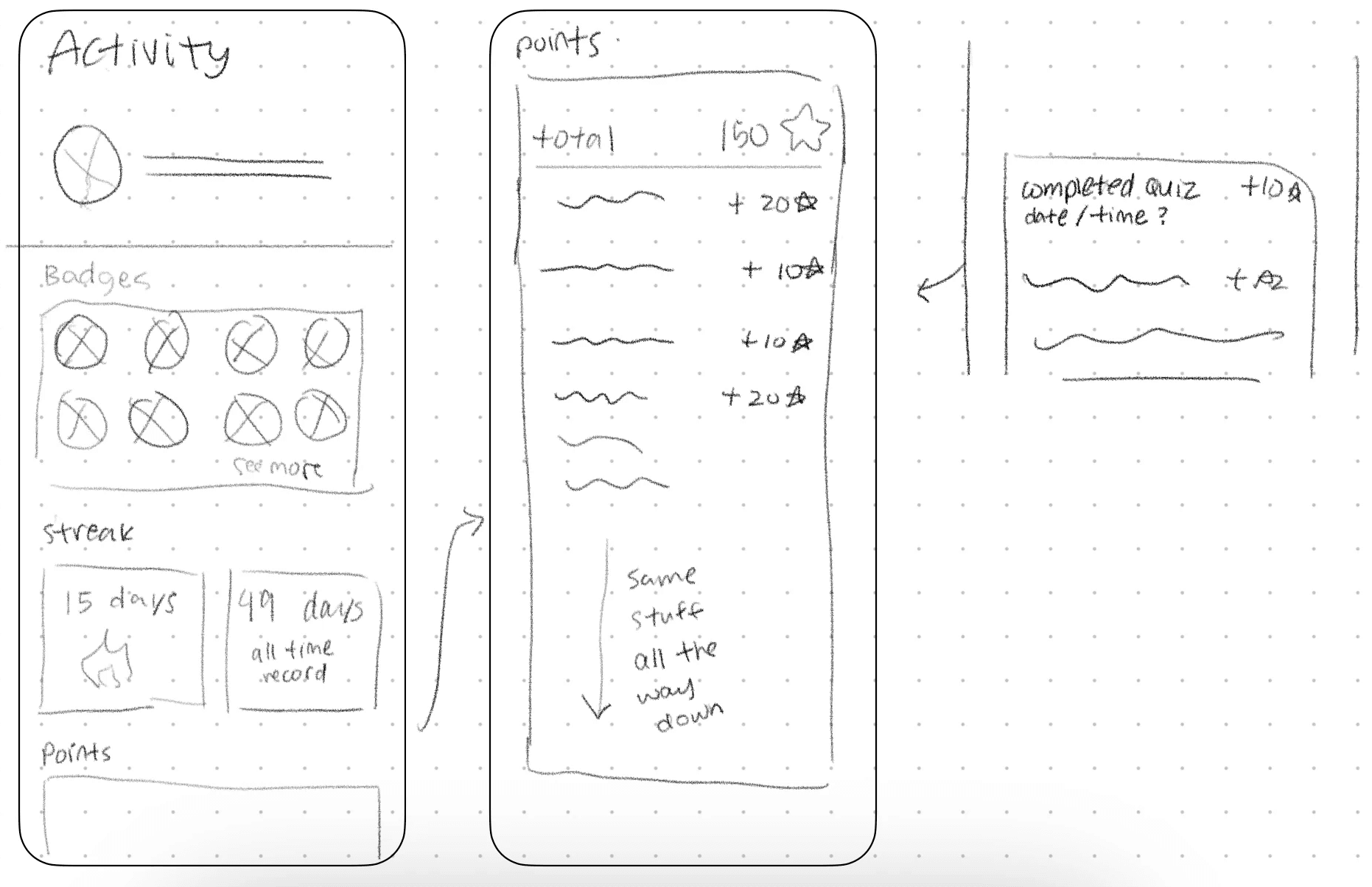
Create the Activity Views (Personal activity, Leaderboard)
Create the AR Tour View
Communicate with team and internal stakeholders about design possibilities and revisions
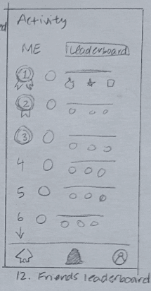
Sketches
Ideation sketches were created using the insights and issues gained during the research process, along with the feature priorities made during the task and usability planning.
Friends, Activities, AR Tour Screens
I was originally tasked with creating the sketches for these pages and features.
I followed convention when designing the pages (specifically the friends list and activity pages) so that it was not confusing for the user when it gets implemented.
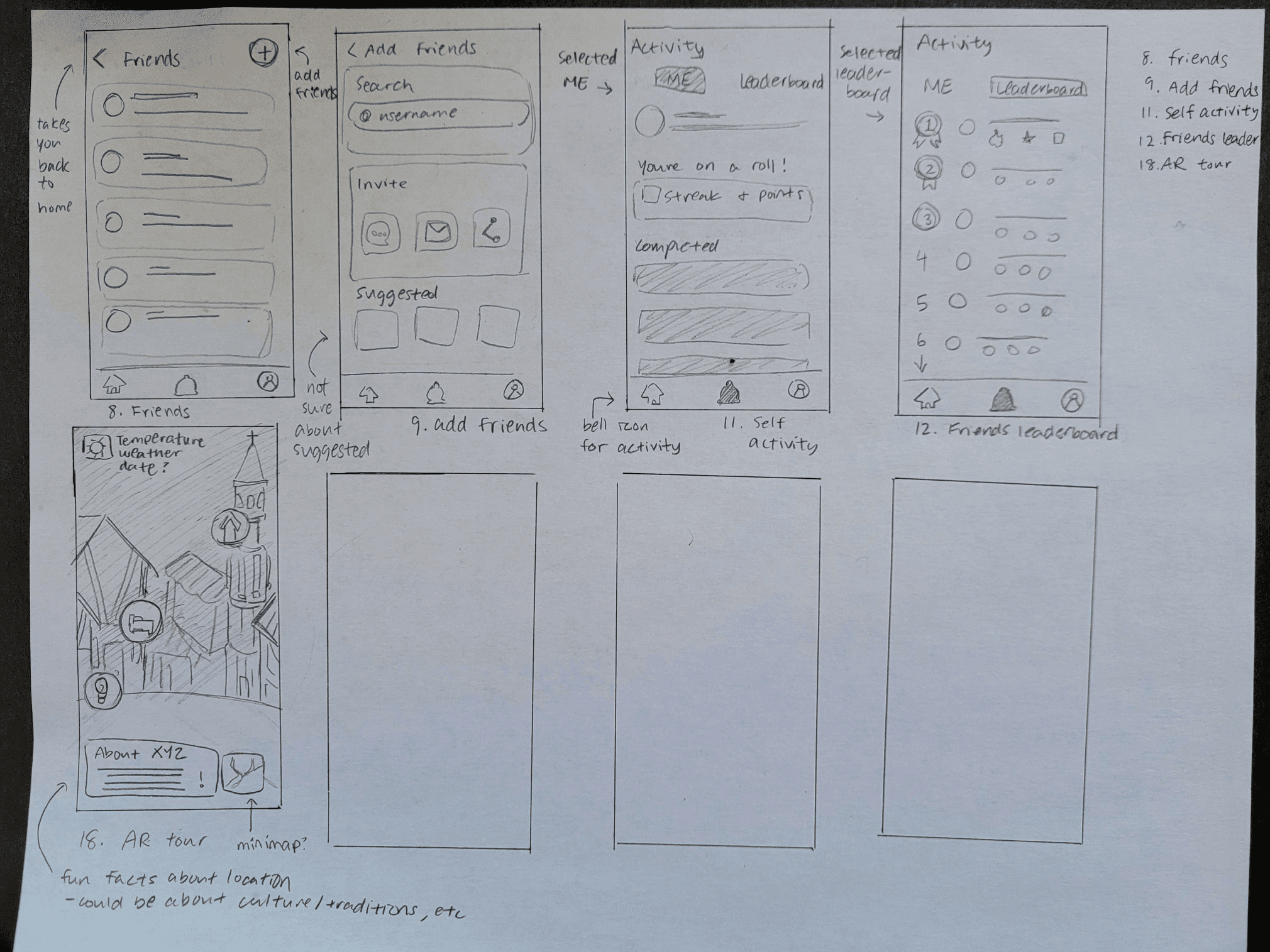
These designs were originally approved to continue, however, due to time and developer constraints, we did not move forward with the friends feature, meaning that 2 of my screens were scrapped. All part of the design process, of course :)
This change also directed me to redesign the activity page to match what was expected from a single-player's activity screen.
Design Thinking - Questions
While I cannot speak for my teammates' design processes, I can speak for mine.
During this phase, I kept some questions in mind:
How would Emily (persona) use this app or feature?
What features would Emily most benefit from?
Why is this design better than another for this feature?
How might I…
How might we personalize features to showcase both individual and community progress toward cultural learning goals, while still motivating and offering a sense of accomplishment for all users, regardless of their position on the leaderboard?
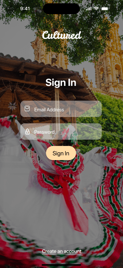
Onboarding and Personal Settings Screens
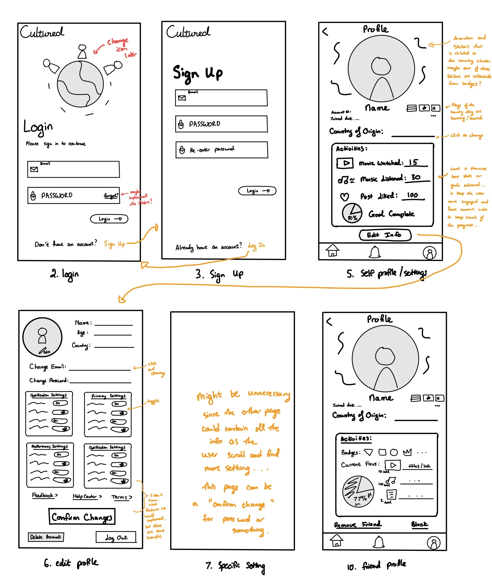
These screens were designed by a teammate. His task was to create the onboarding and settings screens.
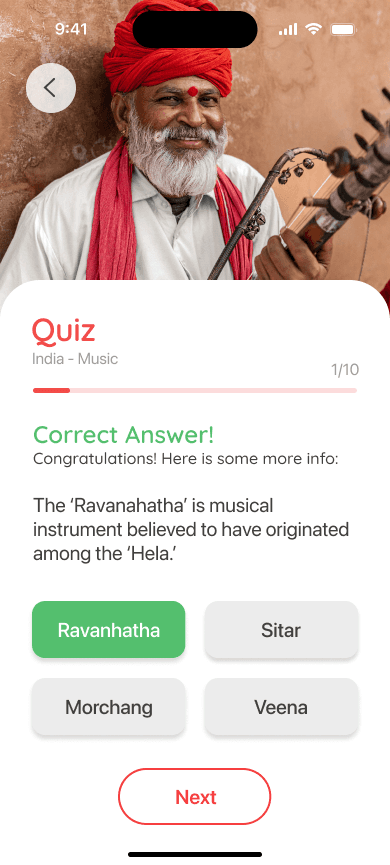
Quiz and Quiz Results Screens
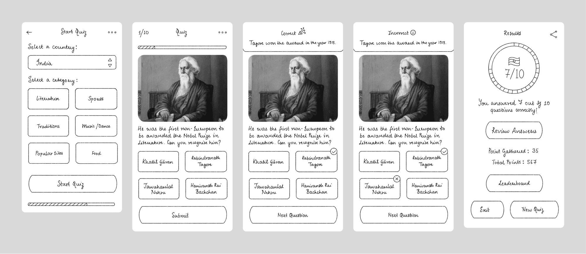
These screens were designed by a teammate. Her task were to create the quiz open, quiz active, and quiz result screens.
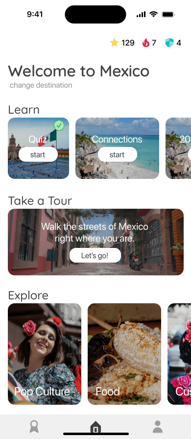
Home and Information Screens
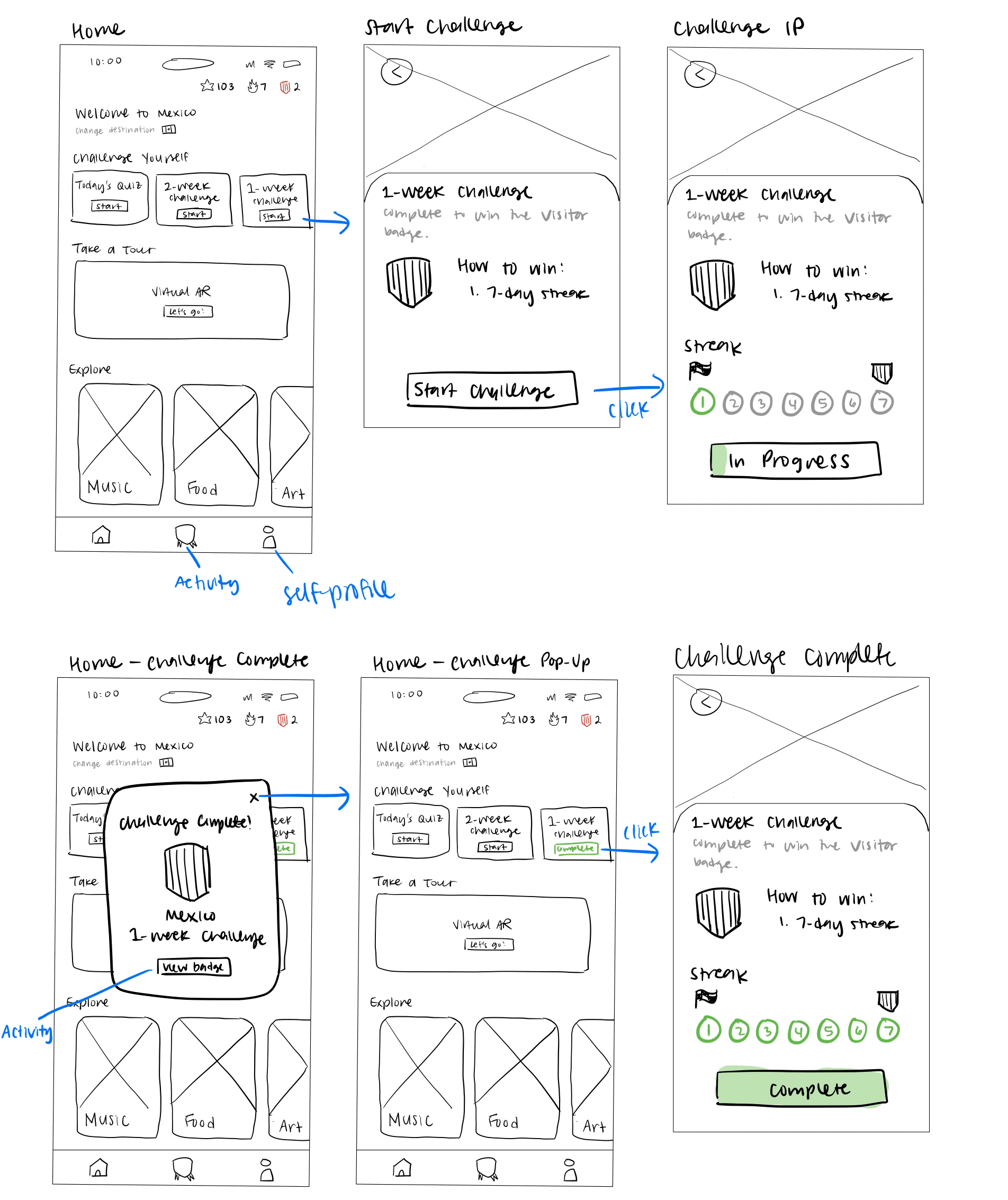

These screens were designed by our team's Design Lead. After consulting again with the developers, these were the designs settled upon for the main information screens. To keep consistency across the different categories, each screen was designed similarly.
Challenges
Speed: Due to the nature of the club, we worked alongside developers while simultaneously designing, meaning that we had to draft new screens quickly.
The ideation cycle
Research → Draft → Sketch → Receive Feedback → Repeat
Quick turnarounds when it came to ideation was something that I was not used to, but coordinating with my design lead and the developers made this process smooth.
Design Process
Design Screens
Review design with the team and stakeholders
Collaboratively provide feedback
Design System
The design system was created with a fun, functional, and simple look in mind to cater towards students who want to learn.
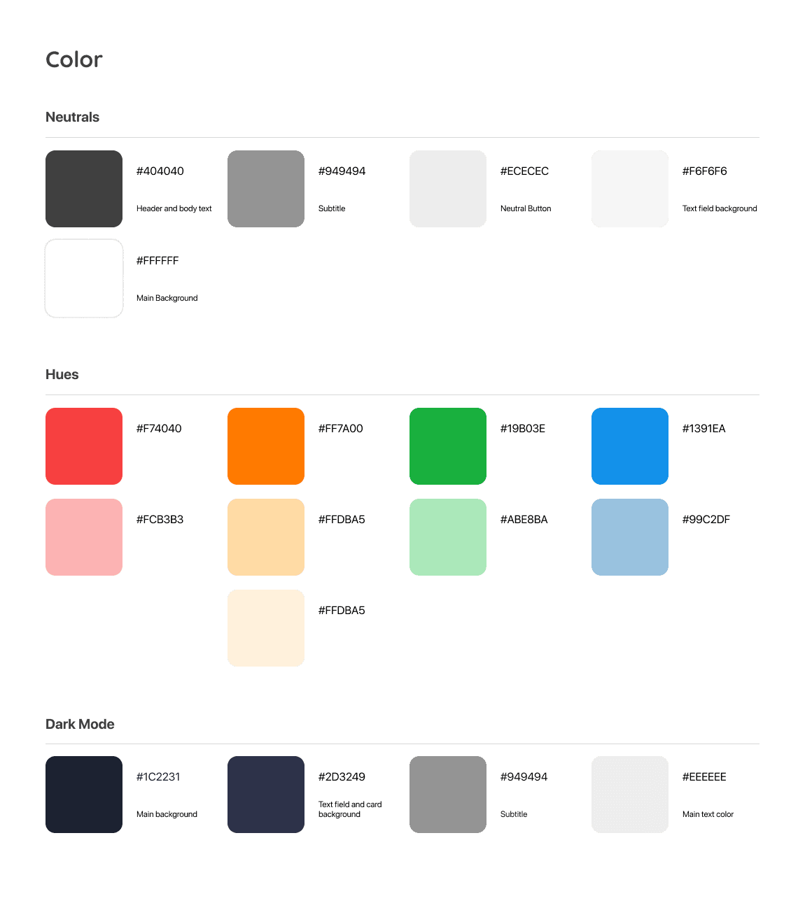

Colors.
Deciding the color pallet of the product was a surprisingly hard endeavor. With each iteration, there would be an issue.
Theming
Version 1 colors were as follows:
#E94E4E
#FF9901
#55BF6E
#2684C6
The head developers felt that this was too similar to Kahoot
Accessibility
Version 2 colors were as follows:
#DE3845
#F8C945
#61C360
#56BABC
This set of colors failed the AA and AAA contrast check
Resolution
The solution came when our design lead suggested to tone the colors down and use black text on the buttons. We experimented with a couple of variations before settling on the final set of colors.
Iterations
Leaderboard
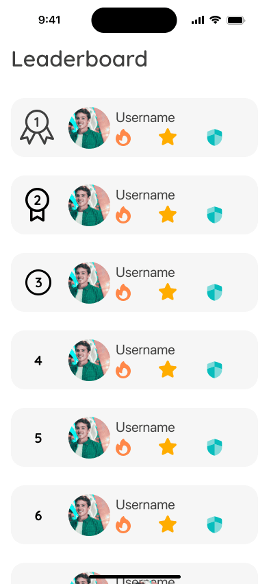
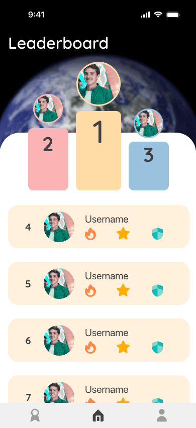
I worked on the leaderboard screen from sketch to completion. The design for the top 3 was revised during the prototyping phase to provide a more visually pleasing experience.
Food Screen
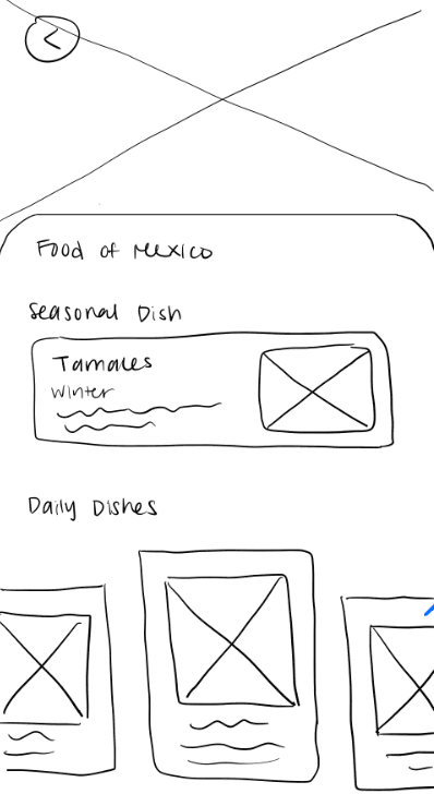

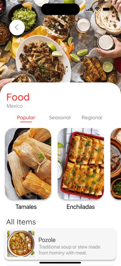
For the food screen, I followed my design lead's wireframe sketch while prototyping. However, we revised the design for this in the final draft so that it followed the prototype for the drinks screen.
Onboarding


I worked on the onboarding features during prototyping. My teammates created the wireframe sketch and the initial prototype, but I was assigned to revise and improve the design language for the final view.
Other than the issue of colors, each of us had differing levels of Figma knowledge.
4 teammates were unfamiliar with auto layout
3 teammates struggled with building components and linking pages for an interactive model.
Collaboration
We worked collaboratively to teach each other Figma features that we were confident in, allowing all of us to grow and learn together.
Design Process
Sketch drafts
Review design with the team and stakeholders
Digitize and play around with colors
Review design with team and stakeholders again
Reiterate
Sketches

Digitizing
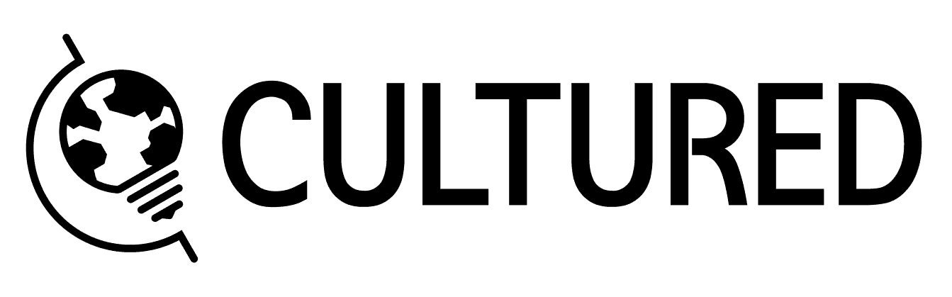
The People Concept
The Global Concept
The Learning Concept
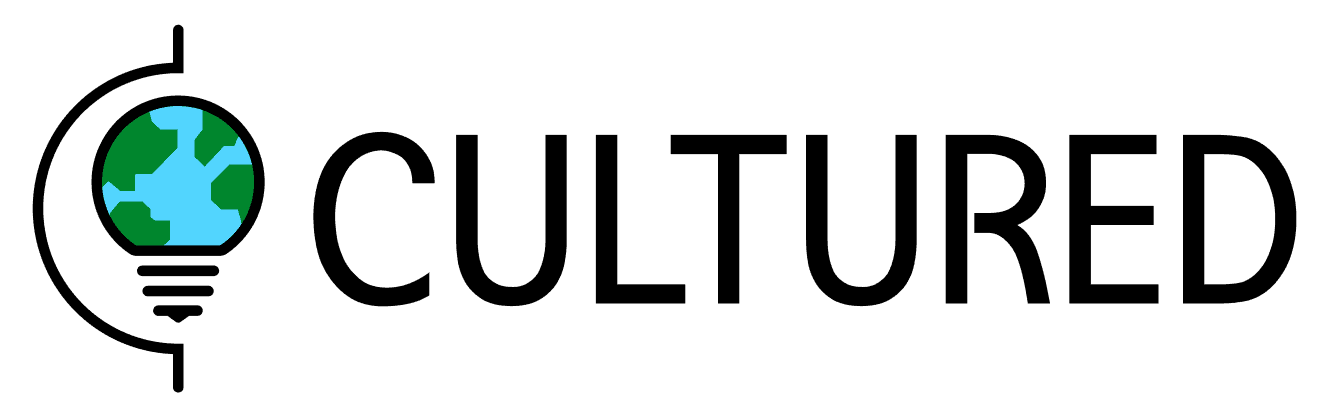
Final Logo
Badge Assets
Fitting within the theme
Cultured is a learning app that revolves around world culture and connecting individuals. However, attempts to depict people together did not go so well.
Collaboration
When my brain ran out of ideas during the sketch phase, I started scouring the internet for help. Then, one of the design team members gave me the bright (literally) idea of using the lightbulb motif.
Knowledge + World = [Cultured] was the formula I settled on when making the final logo iterations.
Reflection
What I learned (and re-learned)
Time management while working with developers: Cultured was a project started in the Georgia Tech IOS Development Club. Due to the nature of the club, the developers would learn back-end while we did the design. We had to make sure we could match their pace by the time they were ready to do front-end so that Cultured didn't fall behind.
I learned how to design and iterate quickly without dropping in quality while also managing my time appropriately so that I didn't lose steam during our sprints.
Handling critique : 5 designers on a team means 5 different opinions. We won't all see everything the same way. During the logo design phase, I thought that my design for the global concept was good enough to use as the final, but my teammates did not.
I was proud of my work, but I also knew that my opinion is not the end all be all. It's important to realize (or re-realize) the reason behind design. I took into account my teammates' feedback and advice, which resulted in the global concept logo.
Areas for Improvement
More time thinking about the users: Due to time constraints, we had to move from research synthesis to design quickly. Looking back, we could have spent more time thinking about how the app would actually work for students. For example, I could have created more detailed user flows or empathy mapping to map out the steps students would take to complete different tasks. This would have helped me identify any potential roadblocks early on and ensure the app was super user-friendly.
Final thoughts
Cultured was something that I 1000% wanted to see to the end. As a second-gen immigrant student, this project was something I really resonated with. I learned a lot about the iteration cycle during this project! Working alongside other designers and developers meant that I could see my work being built in real time, and that was very fulfilling.
I loved working on this project. IOS Club did a great job of structuring. Based on how well this project went, I'm already prepared to sign up for another project next semester!